I found this logo which I thought was really nice. Although it is a bit complicated I think I still remains clean and streamlined. I think the iconography also thoroughly represents everything the company has to offer: a restaurant and baked goods. I also really like the font choice on this one.

I remembered going to this tea place when I was visiting Savannah a year ago and I just remember thinking that the design of the place was really quaint, cozy, and old fashioned. They even did afternoon tea there which is pretty awesome. Anyway, I think this old fashioned style logo is pretty fitting of this place.

I also think the redesign of the Science channel logo is pretty neat. The new design looks like part of the periodic table, so it does a good job of provoking a science image for me. The new look is also a lot cleaner and I like the use of only the orange, which seemed to be the stand out color on the old logo anyway.

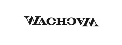
This logo design is also really cool. I don't know if it is being used anywhere for Wachovia, but the fact that the image is the same right side and upside down is really interesting.

This little logo is really cute. I love the small cityscape at the top. It seems very neat, but also quaint. The idea of urban is portrayed, but not in the typical grungy, gray, and dirty way most of us think of. Instead, this logo uses bright pops of color and a neat, clean typeface.
By the way, I found the site logodesignlove.com to be really helpful.
No comments:
Post a Comment