Some of my ideas for the ad project:
1. Branding the logo into the top of a meatpie (thanks to the creative mind of Jessica!)
2. Something like a plane ticket or travel poster...like take a trip to the outback and you don't even need a passport
3. Aussie Aussie Aussie Oy Oy Oy!
4. Just a hop, skip, and jump away
5. Meatpies, Meatpies, Savory and Sweet Pies! (may bring up a bad connotation from Sweeny Todd...)
6. Incorporate the caution kangaroo sign some more
7. Australian flag on a meat pie
8. Meat + Pie... Trust us, It's Good
9. Australians eat over 5,000,000 meat pies a year...do your part.
3.25.2009
Thinking about the Advertisement
Here are some fun print ads I've been looking at:
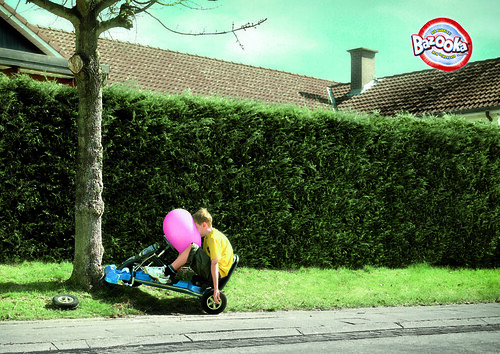
This one is just funny. I like how there isn't any type or description and the image can speak for itself.

I guess this one may be considered more of a poster. However, I like the collage technique they used. It reminds me of the ads we created in Intro to GRD. It also has a very Dada feel with the black and white images.

This one is really weird, but very interesting. I like how they made a reference to Surrealism, because they're talking about the "weird world of investment."

This one is really creative in my opinion, although I don't really understand the connection between Chavez and Luxor highlighters...? But anyway, I think they took a creative approach, kind of like the highlighter will show you what's important.

This one is funny. I like these type adds because they show you something unexpected.

This one must be pretty old. I was looking for illustrated print ads, since that's probably the direction I'll be going. I like the retro feel, because I think the Australian Bakery is kind of retro-ish.

I love this one! I like how it looks vintage, but uses contemporary graphic styles.
This one is just funny. I like how there isn't any type or description and the image can speak for itself.
I guess this one may be considered more of a poster. However, I like the collage technique they used. It reminds me of the ads we created in Intro to GRD. It also has a very Dada feel with the black and white images.
This one is really weird, but very interesting. I like how they made a reference to Surrealism, because they're talking about the "weird world of investment."
This one is really creative in my opinion, although I don't really understand the connection between Chavez and Luxor highlighters...? But anyway, I think they took a creative approach, kind of like the highlighter will show you what's important.
This one is funny. I like these type adds because they show you something unexpected.
This one must be pretty old. I was looking for illustrated print ads, since that's probably the direction I'll be going. I like the retro feel, because I think the Australian Bakery is kind of retro-ish.
I love this one! I like how it looks vintage, but uses contemporary graphic styles.
3.22.2009
Direct Mailer Revision
I've been working on trying to incorporate more of my brand colors into the direct mailer piece. Originally, the mailer was all yellow and black. Now, I've done the inside white with the brand colors used on the logo and some of the text. I was concerned that the white on the inside would be too dull and boring. I don't know though, I don't think it's too bad. I also changed the background of the cut out image to be striped with my brand colors rather than black. Here's a comparison...
BEFORE:
 AFTER:
 What do you think?
BEFORE:
 AFTER:
 What do you think?
Subscribe to:
Posts (Atom)