I really like the colors on this stationary. They're vibrant but not too in your face. It also incorporates the squares in the logo, so the whole set is tied together.

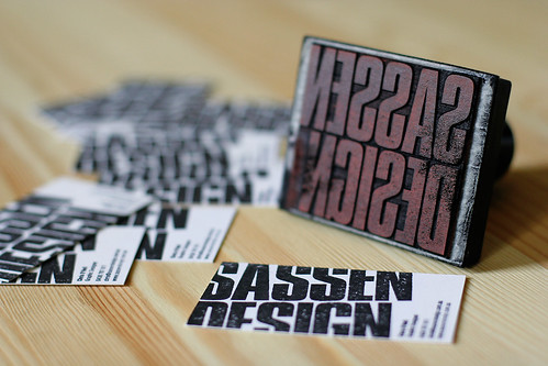
These business cards are so cool. They used a stamp to make the logo bleed off the card. It's a cool technique and maybe I can get the same effect in Illustrator. Plus, this design is rustic, which would be fitting for my company.

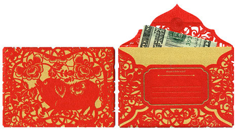
I also found this super cool envelope that is completely die cut. I'm sure this would cost a mint, but it is possibly the coolest thing ever and love piggies...

The bold colors of this design attracted me. The logo is also incorporated in a cool way.

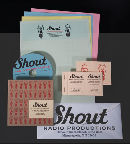
This is another more rustic look, and by rustic I mean vintage-y. I like how big the logo is on the envelope, maybe I could incorporate that.
No comments:
Post a Comment